Ever paint a room “a nice neutral” and somehow it ends up feeling like a sad office hallway? Yep. Color is powerful. Using Color to Set the Tone is one of the fastest ways to change how a space feels—calm, cozy, bright, elegant, playful—without buying a truckload of décor.
Using Color to Set the Tone: Start With the Mood, Not the Paint Chip
Don’t start with “I like green.” Start with “I want this room to feel like a deep breath.” Mood first, color second. When you choose color based on emotion, your home stops feeling random and starts feeling intentional.
- Calm: soft greens, muted blues, warm neutrals
- Cozy: warm creams, terracotta, caramel, soft browns
- Energized: crisp whites, bold accents, higher contrast
- Elegant: deep navy, charcoal, warm taupe, rich jewel tones
How Themes Influence Mood
Warm vs Cool Colors: The Room’s “Temperature Setting”
Warm colors feel inviting and cozy. Cool colors feel clean and calm. You can mix them—just make one the main character. (Otherwise your room can feel like it’s having two different moods at once.)
- Warm: cream, beige, peach, terracotta, warm wood
- Cool: blue, gray, mint, icy white, silver
- Quick tip: look at your light bulbs—warm bulbs change everything
The 60/30/10 Rule (So Your Palette Doesn’t Go Rogue)
If you’ve ever bought a “cute” accent pillow and suddenly your living room looks like a clearance aisle—this rule is for you. It helps Using Color to Set the Tone feel controlled, not chaotic.
- 60% = main color (walls, large rug, big furniture)
- 30% = secondary color (curtains, chairs, bedding)
- 10% = accent color (pillows, art, vases, small décor)
Neutrals Aren’t “No Color” — They’re the Background Music
Neutrals set the stage. The right neutral can feel warm and cozy, or crisp and modern. The wrong one can feel flat, gloomy, or oddly purple at night. (Yes, neutrals can be dramatic.)
- Warm neutrals: cream, sand, greige, warm taupe
- Cool neutrals: bright white, cool gray, blue-gray
- Test tip: sample on 2 walls + check morning AND night
Modern Decor Themes
Accent Colors: The “Personality” Without the Commitment
Want a room to feel more alive without repainting? Add one accent color and repeat it a few times. That’s the easiest form of Using Color to Set the Tone—small, intentional pops.
- Choose one accent: mustard, navy, olive, rust, blush
- Repeat it 3–5 times: pillow, art, book spine, vase, throw
- Keep it controlled: one bold color beats five “cute” ones
High Contrast vs Low Contrast: Energy Level Control
Contrast is like caffeine for a room. High contrast feels bold and energetic. Low contrast feels soft and relaxing. If your room feels “too much,” it’s often contrast—not the color itself.
- High contrast: black + white, navy + white, dark wood + bright walls
- Low contrast: tone-on-tone neutrals, soft monochrome palettes
- Balanced: mostly low contrast with one high-contrast moment (art, mirror frame)
Room-by-Room Color Goals (So the Mood Matches the Function)
Different rooms need different vibes. Your bedroom shouldn’t feel like a coffee shop, and your office shouldn’t feel like a nap trap. Use color to support what you do there.
- Bedroom: calm, softer tones, low contrast
- Living room: warm + welcoming (easy neutrals + cozy accents)
- Kitchen: bright, clean, energetic (crisp whites + fresh accents)
- Office: focused, clear (cool neutrals + limited accent color)
Color + Light: Why Your Paint Looks Different at 7 PM
Lighting changes color more than you think. A paint that looks perfect at noon can look green, pink, or dull at night. To succeed at Using Color to Set the Tone, you have to consider lighting like it’s part of the palette.
- North-facing rooms: cooler light (warm colors help)
- South-facing rooms: warmer light (cooler tones can balance)
- Warm bulbs: make colors feel cozier
- Daylight bulbs: make colors feel crisp (sometimes too crisp)
Easy “Tone Shifts” Without Repainting Anything
Don’t want to paint? You can still change the mood with textiles, art, and accessories. Small changes = big vibe shift. This is Using Color to Set the Tone in its easiest form.
- Swap pillow covers to a new accent color
- Add a throw blanket in a warmer or cooler tone
- Change curtains (they’re basically giant color panels)
- Hang one large art piece that sets the palette
- Add a rug to anchor the room’s color story
Your Quick Color Checklist (So It Feels Intentional, Not Random)
The goal isn’t “perfect.” The goal is a room that feels right when you walk in. When you’re Using Color to Set the Tone, this checklist keeps you from accidentally building a “miscellaneous” theme.
- Pick the mood: calm, cozy, bright, elegant, playful
- Choose a base: warm neutral or cool neutral
- Add one accent: repeat it 3–5 times
- Control contrast: low for calm, high for energy
- Check lighting: morning + night before committing
Final thought: color isn’t just decoration—it’s emotional design. Start with how you want to feel, and the palette choices get way easier.
More Theme Ideas You Might Like
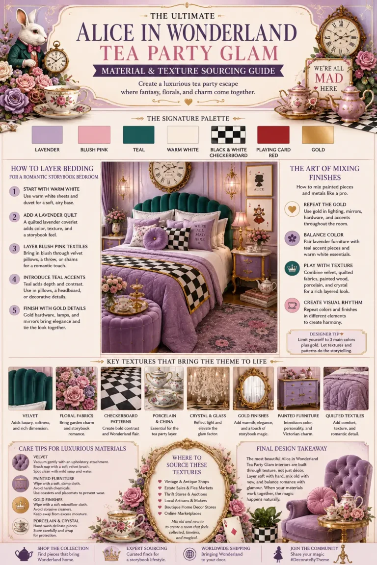
The Ultimate Alice in Wonderland Tea Party Glam Material & Texture Sourcing Guide