
Alice in Wonderland Tea Party Glam is one of the easiest decorating themes to get wrong. When done well, it feels whimsical, luxurious, romantic, and storybook-inspired. When done poorly, it can quickly resemble a birthday party supply aisle, a themed restaurant, or a room filled with random novelty merchandise.
The secret to creating a sophisticated Wonderland-inspired interior is understanding that the theme should function as a design influence rather than a costume. The most successful rooms borrow colors, patterns, shapes, and storytelling elements from Wonderland while still feeling like beautiful homes people actually want to live in.
If your Alice-inspired room feels cluttered, childish, overwhelming, or visually chaotic, one of these common decorating mistakes is usually the reason.
🏰 New to this aesthetic? Before diagnosing your styling pitfalls, start with our master breakdown Alice in Wonderland Decor: A Modern Fairytale Home You Can Actually Live In to see how the entire look fits together seamlessly.
Mistake #1: Theme Overload (The “Everything Is Wonderland” Problem)
The Core Issue
The biggest mistake decorators make is treating Alice in Wonderland like a collection of props instead of a design style.
They fill every wall with playing cards.
Every shelf gets rabbits.
Every table gets teacups.
Every corner gets clocks.
Before long, the room stops feeling magical and starts feeling like a themed gift shop.
Why It Looks Cheap
The human eye needs visual resting space.
When every object is demanding attention, nothing actually stands out.
The room becomes visually exhausting.
The Design Solution
Follow the 70/30 Rule.
70% of the room should consist of beautiful foundational design:
- Quality furniture
- Warm white walls
- Elegant lighting
- Thoughtful layouts
- Rich textures
Only 30% should contain Wonderland storytelling details.
A checkerboard rug, a rabbit sculpture, and one playing-card artwork can tell the entire story without overwhelming the room.
A great example of restraint is our Alice in Wonderland Tea Party Glam Living Room Style Recipe, where checkerboard accents, floral details, and storybook references are carefully balanced against classic furniture and warm neutral space.
Mistake #2: Using Bright Cartoon Colors Instead of Soft Fantasy Colors
The Core Issue
Many people immediately search for the brightest purple, pink, turquoise, and red they can find.
Unfortunately, these highly saturated colors often make the room feel juvenile.
Why It Looks Cheap
Alice in Wonderland Tea Party Glam is built around pastel fantasy colors, not neon colors.
Neon shades create visual tension.
Pastel shades create visual harmony.
The Design Solution
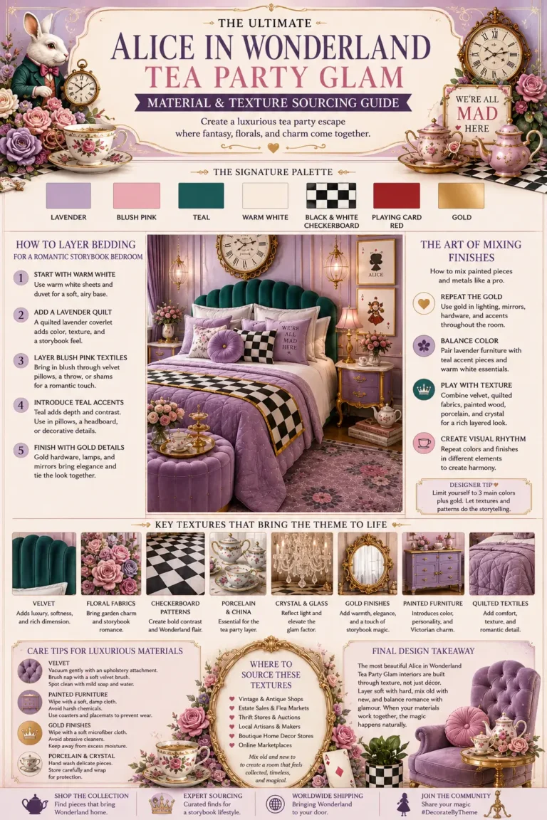
Use the established Wonderland palette:
- Lavender instead of bright purple
- Blush pink instead of hot pink
- Teal instead of turquoise
- Warm white instead of stark white
- Small touches of playing-card red instead of large red surfaces
These softer colors create the romantic tea-party atmosphere people are actually trying to achieve.
If you’re unsure how these softer fantasy colors work together in a real home, explore our Alice in Wonderland Tea Party Glam Bedroom Style Recipe, where lavender, blush pink, teal, warm white, and gold create a romantic Wonderland-inspired retreat without feeling childish.
These softer colors create the romantic tea-party atmosphere people are actually trying to achieve. If you need help finding these exact, grown-up shades at the store, check out our real-world brand swatches inside the Alice in Wonderland Tea Party Glam Paint Colors Guide.
Mistake #3: Ignoring the Warm White Foundation
The Core Issue
Decorators become excited about lavender, teal, blush pink, checkerboard patterns, and gold accents.
Then they forget to include enough neutral space.
Why It Looks Cheap
Without visual breathing room, every color competes for attention.
The room feels crowded even when there isn’t much furniture.
The Design Solution
Warm white should occupy the largest percentage of the room.
Use it on:
- Walls
- Trim
- Ceilings
- Countertops
- Background furniture
- Curtains
The warm white foundation allows the fantasy colors to shine without becoming overwhelming.
Notice how warm white acts as a visual anchor throughout our Alice in Wonderland Tea Party Glam Kitchen Style Recipe, allowing colorful cabinetry and whimsical accents to stand out while keeping the space bright and sophisticated.
🛍️ **Looking for unique, small-batch pieces?** To cut down your shopping time and avoid generic, mass-produced merchandise, use our comprehensive Alice in Wonderland Tea Party Glam Artisan Guide to discover the exact Etsy printmakers, furniture artists, and boutique lighting creators we recommend for this aesthetic.
Mistake #4: Too Much Checkerboard Pattern
The Core Issue
Checkerboard floors are one of the strongest Wonderland references available.
The problem happens when people add checkerboard flooring, checkerboard wallpaper, checkerboard curtains, checkerboard pillows, checkerboard artwork, and checkerboard accessories all at once.
Why It Looks Cheap
The pattern loses its impact.
Instead of feeling iconic, it becomes visual noise.
The Design Solution
Choose one dominant checkerboard feature.
Examples:
- Bathroom floor
- Patio floor
- Area rug
- Coffee table
- Accent wall
One large checkerboard statement almost always looks more sophisticated than six smaller checkerboard elements.
One large checkerboard statement almost always looks more sophisticated than six smaller checkerboard elements. See this balanced pattern execution styled beautifully in our complete Alice in Wonderland Bathroom Style Recipe.
Mistake #5: Using Character Merchandise as Decor
The Core Issue
Many decorators start purchasing mass-produced character merchandise.
Alice figurines.
Cartoon artwork.
Licensed products.
Character pillows.
Novelty signs.
Why It Looks Cheap
Most character merchandise is designed for children rather than interior design.
The quality, colors, and proportions rarely match sophisticated home decor.
The Design Solution
Use references instead of characters.
Think:
- Vintage clocks
- Pocket watch artwork
- Playing cards
- Floral teacups
- Checkerboard patterns
- Rabbit sculptures
- Storybook illustrations
These references feel elevated and timeless.
Our Alice in Wonderland Tea Party Glam Hallway Style Recipe demonstrates how rabbit figures, playing card artwork, vintage clocks, and floral details can reference the story elegantly without relying on cartoon merchandise.
Mistake #6: Forgetting the Glam Layer
The Core Issue
Many Wonderland rooms successfully achieve the whimsical side but completely miss the glam side.
Why It Looks Cheap
Without glamorous finishes, the room can start feeling more playful than luxurious.
The theme becomes cute instead of sophisticated.
The Design Solution
Gold is essential.
Use gold for:
- Mirrors
- Lighting
- Frames
- Hardware
- Table bases
- Shelf brackets
- Decorative accents
The gold layer is what transforms Wonderland into Wonderland Tea Party Glam.
For a perfect example of how gold elevates the entire aesthetic, browse our Alice in Wonderland Tea Party Glam Patio Style Recipe, where mirrors, lighting, furniture frames, and decorative accents create a luxurious garden tea-party atmosphere.
Mistake #7: Decorating Only With Flat Surfaces
The Core Issue
Many themed rooms rely almost entirely on wall art, signs, and printed decor.
Why It Looks Cheap
The room feels flat.
Everything becomes two-dimensional.
There is no visual depth.
The Design Solution
Introduce tactile variety.
Layer:
- Velvet pillows
- Floral arrangements
- Glass jars
- Porcelain tea sets
- Textured rugs
- Drapery
- Metallic finishes
Great rooms appeal to both the eyes and the sense of touch.
Mistake #8: Cluttering Every Shelf and Tabletop
The Core Issue
Wonderland-inspired accessories are fun to collect.
Unfortunately, people often buy too many.
Why It Looks Cheap
Tiny scattered objects create visual chaos.
Instead of seeing the room, visitors only see clutter.
The Design Solution
Create intentional vignettes.
Group smaller items together.
Examples:
- Three apothecary jars on one tray
- A stack of books with a rabbit figurine
- A floral arrangement beside a clock
Designer rooms use clusters.
Amateur rooms use scatter.
Designer rooms use clusters. Amateur rooms use scatter. To see how to group teacups and trays onto a flawless counter display, browse our Alice in Wonderland Coffee Bar Style Recipe.
Mistake #9: Mixing the Wrong Metallic Finishes
The Core Issue
Chrome, brushed nickel, black metal, silver, gold, and brass all end up competing in the same room.
Why It Looks Cheap
Too many metallic finishes create inconsistency.
The room loses its sense of intentional design.
The Design Solution
Choose one dominant finish.
For Alice in Wonderland Tea Party Glam, gold should lead the room.
Brushed gold, antique gold, and warm brass all support the romantic storybook atmosphere beautifully.
The Secret to Making Wonderland Look Expensive
The most beautiful Alice in Wonderland Tea Party Glam interiors are surprisingly restrained.
They don’t rely on dozens of props.
They don’t use cartoon merchandise.
They don’t cover every surface with theme references.
Instead, they use a soft palette of lavender, blush pink, teal, warm white, black-and-white checkerboard accents, playing-card details, and gold finishes layered over beautiful furniture and timeless design principles.
When the room feels like a luxury home first and a Wonderland fantasy second, you’ve found the perfect balance.
More Theme Ideas You Might Like